Create Your First Project
Start adding your projects to your portfolio. Click on "Manage Projects" to get started
Triathlon AZ
Date
2023
Location
Baku, Azerbajjan
Project Type
Logo and brand identity
Azerbaijan Triathlon Federation
The new logo is based on a triangle form, constructed from three interconnected elements, symbolizing the three core disciplines of triathlon:
running, swimming, and cycling.
This geometric structure reflects motion, precision, and athletic synergy — the essence of triathlon.
The goal was to create a modern, powerful, and internationally relevant identity that communicates the federation’s spirit with clarity and confidence.
Process
As part of the rebranding, we:
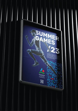
• developed a new logo built from a triangular composition representing the three sports;
• created a signature pattern inspired by rhythm, movement, and speed;
• assembled a complete identity system with consistent application rules;
• designed the official triathlon uniform, ensuring a bold and recognizable appearance in global competitions;
• designed a new website, integrating structure and identity into a unified digital experience.
The entire system is rooted in geometry, athletic motion, and a clean visual rhythm.
Result
The federation received:
• a cohesive, international-level brand,
• a strong and scalable geometric mark,
• a modern identity that reinforces the federation’s presence on the global stage,
• professional sportswear design and a fully updated website.
The new style communicates strength, movement, and the unity of the three triathlon disciplines.


